Sunday, 26 January 2014

Psychedelic Wes Wilson


One of the common works graphic desinges use to do back in the day was to make event posters. Wes Wilson was one of these designers with as twist though. The psychedelic 60s brought along some of the most iconic rock posters of today modern day and age. Inspired by art Nuevo and the drugs available at the time, rock posters with typography which became more image than type  littered the rock world.


We Wilson is one of the pioneers of this movement creating iconic posters for many big name bands.  One of the first things we notice is Wilsons colour palette. 60s art tended to be colourfull luring in inspirations from various aspects. In this case Wilson drew a lot of inspiration from the concerts them selves, using the concert lighting colours to make his posters. He kept experimenting through out his career  as a ‘graphic desinger’. This is one of the key values a graphic designer should have, pushing the boundaries. As his works progressed we see more exaggerated aspects in his poster and more distortion.
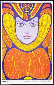


One of this most striking visual points of his works is the typography.  The type was custom made for each poster, making it look like it was meant to be. All though the type seemed illegible it was well received by the public. Looking back in time type has changed immensely over the years. one of the most notable aspects of typography is that it is constantly fluctuating, periods of serif type, periods of san serif type, periods of organized grid work type. But after all of this organization there will always be a period of disorganization, radical new typography. In this case the 60s set it off and for the periods to come type will remain disorganized in different ways through punk and grunge. Just compare De Stil type to psychedelic type, they are polar opposites. 


This is just another way graphic design is constantly fluctuating.

Victor Moscoso


Once again we shall be doing a quick recap about the psychedelic 60s. This was a time of drugs and free love. And art was another way of these youths expressing themselves. Music was big at the time, almost religious and therefore it was a flourishing year for graphic design with music posters on high demand.


During the 60s there was another movement called pop art which was very big at the time and which also inspired many graphic designers, including Moscoso. Muscoso was acutally properly trained as a graphic designer. He drew inspirations from a multitude of places such as comic books, Victorian images and like most artists within psychedelic ,art  Nouveau. 


In a way one may consider Moscosos works as Op Art due to the use of colour and repetition, to create almost vibrationg graphics. This was all due to his play on colour which one will notice is present in most of his works.


The New Typography


This was a graphic design movement which was predominantly based around typography between the 1920s and the 1930s. Heavily inspired by the Bauhaus movement, the  new typography brought graphics and information design to the artistic Europe. They rejected traditional  styles and forms of type in symmetrical columns. Instead they would rearrange the type into what one may call a harmonious asymmetrical composition. They combined type with image, the image usually being a photomontage, making impressive use of blank space to their advantage.


 They wanted to keep attention on the content rather that the form. Content over form. Inspired from Constructivism in soviet Russia and as already mentioned Bauhaus one of the leading designers Jan Tschichold molded the movement with accessible guideline’s in his signature book “Die Neue Typographie” (The new Typography) (1928).


 Within that instant typographers and printers adapted this new mentality within typography in almost everything from business cards and brochures to magazines and advertisements.

Stefan Sagmeister


Sagmeister is just one example of todays modern graphic designers. This graphic designer is always looking for new and original ways to create his art works. In his opinion a mistake modern graphic designers are making today is that they use too many short cuts. Like many others before his Stefan specializes in both ‘graphic design’ and typography.


In these two cases we see how Stefan has pushed the boundaries for typography to a new level. Creating these slightly dark images. Clearly inspired from grunge typography; this is due to the facts that the letters have the authenticity of hand writing (or hand carved in this case). Ironically he took combining text and image to a whole new level, turning them into a single object, turning the human body into a canvas, it is the same concept as a tattoo artist. Putting originality aside, the works look good, they have that raw look which is highly sought after in todays modern day and age. As I have said though these blogs, art is constantly growing, evolving and adapting. Just like Stefan was inspired by different graphic designers, he shall himself inspire other great designers in the future.