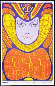
One of the common works graphic desinges use to do back in
the day was to make event posters. Wes Wilson was one of these designers with
as twist though. The psychedelic 60s brought along some of the most iconic rock
posters of today modern day and age. Inspired by art Nuevo and the drugs available
at the time, rock posters with typography which became more image than
type littered the rock world.
We Wilson is one of the pioneers of this movement creating
iconic posters for many big name bands. One
of the first things we notice is Wilsons colour palette. 60s art tended to be
colourfull luring in inspirations from various aspects. In this case Wilson
drew a lot of inspiration from the concerts them selves, using the concert
lighting colours to make his posters. He kept experimenting through out his
career as a ‘graphic desinger’. This is
one of the key values a graphic designer should have, pushing the boundaries.
As his works progressed we see more exaggerated aspects in his poster and more
distortion.
One of this most striking visual points of his works is the
typography. The type was custom made for
each poster, making it look like it was meant to be. All though the type seemed
illegible it was well received by the public. Looking back in time type has
changed immensely over the years. one of the most notable aspects of typography
is that it is constantly fluctuating, periods of serif type, periods of san
serif type, periods of organized grid work type. But after all of this
organization there will always be a period of disorganization, radical new
typography. In this case the 60s set it off and for the periods to come type
will remain disorganized in different ways through punk and grunge. Just
compare De Stil type to psychedelic type, they are polar opposites.
This is just another way graphic design is constantly
fluctuating.


No comments:
Post a Comment